Sunday, July 27, 2008

Cartogram-Energy Consumption


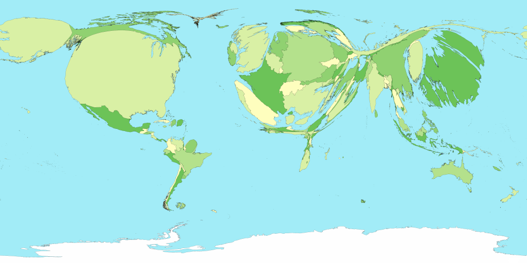
Another variable is used to graph area. The size of each area represents the size of the variable that is being maped; it is distorted to match the value of the variable. I found this one to be quite interesting .. Energy consumption!! What a hot topic today with our current gas prices. The map on the left is a normal world map which the cartogram on the right represents energy consumption. The USA looks kind of puffy and swollen!!


Isolines/Bathymetric Map


Isoline maps depict geographic areas with lines of equal value. A bathymetric map depicts elevation of surfaces below water. Lines of equal value represent the elevation. Downloaded from:

Sunday, July 20, 2008

Star Plots


A star plot compares multiple variables for each observation. The center point or radii is the actual observation point. This matrix compares different vehicles based on price, milease, head room, trunk space, etc. Data and download available at:

Correlation matrix


A correlation matrix is done to see where there is a correlation among the data. In this matrix, investor funds are correlated to regions, styles of investment, secort, bonds, and the foreign exhange.
Downloaded from:

Similarity matrix


A similarity matrix is used to show how similar (or not) the variables are to one another. This matrix shows the similarity of molecules.
Downloaded from:
http://images.google.com/imgres?imgurl=http://www.biosolveit.de/HTSview/images/matview.jpg&imgrefurl=http://www.biosolveit.de/HTSview/screenShots/matview.html&h=622&w=808&sz=745&hl=en&start=18&um=1&tbnid=1avTxXr2212mxM:&tbnh=110&tbnw=143&prev=/images%3Fq%3Dsimilarity%2Bmatrix%26um%3D1%26hl%3Den%26rlz%3D1T4GGIK_enUS281US281%26sa%3DN

Stem and Leaf Plot

A stem and leaf plot uses the higher number as the stem and the secondary numbers as the leaf. These plots show the frequency of values. This plot show infant mortality rates in Western Africa.

Downloaded from: http://images.google.com/imgres?imgurl=http://mainland.cctt.org/mathsummer/JosephBond/StemAndPlots/images/table2.gif&imgrefurl=http://mainland.cctt.org/mathsummer/JosephBond/StemAndPlots/stem-and-leaf_std.htm&h=395&w=291&sz=6&hl=en&start=1&um=1&tbnid=BsYfupzY6aptDM:&tbnh=124&tbnw=91&prev=/images%3Fq%3Dstem%2Band%2Bleaf%2Bplot%26um%3D1%26hl%3Den%26rlz%3D1T4GGIK_enUS281US281%26sa%3DN

Box Plot


A box plot which is also known as box and Whisker Plot, is a summary of a set of data, in this case, scores from site samples of a creek.

Histogram


A histogram tablulates frequency. This histogram portrays the forecasted and observed UV idex.

Parallelcoordinate graph


A parallel coordinate graph represents each variable being graphed on a vertical axis; it explores the relationship among the variables.

Triangular Plot


Trianglular plots are often used to portray soils however this one shows the percentage of votes from each region for the parties in the United Kingdom. The lines of each triangle represent the percentage of each party vote for that area.
Downloaded from:

Windrose


A windrose shows the wind direction and wind speed in a particular location; in this map - Seattle, Washington.
Downloaded from:

Climograph


A climograph shows the relationship between temperature and precipitaton.
Downloaded from:

Population Profile

Population profiles or population pyramids are commonly used to show the trends in population statistics over time. The first pyramid shows that Kenya has rapid growth .. they have a very young population with high fertility rates and high death rates among their older population.
Downloaded from:

Scatterplot


A scatterplot portrays 2 variables; the dot is the observation and the line represents the trend.
Downloaded from:

Index Value Plot


An index value plot is another type of visualization map. An index value (not an absolute value) is plotted on a line graph.
Downloaded from:

Lorenze Curve


A Lorenze Curve measures inequality and is commonly used to show the disparity in earnings to total income.

Bilateral Graph


A bi-lateral graph is a visualization map. Two related variables are identified as well as their overlaps. This map represents bilateral humanitarian assistance from various countries.

Unstandardized Choropleth Map

Unstandardized choropleth maps are unordered maps; there is no specific ranking assigned to the class - one category is not higher or lower than the other.
Donwloaded from:

Univariate & Standardized choropleth maps


A univariate map shows only one specific set of data; in this case population. This map is also standardized in it represents population by sq. mile.
Downloaded from:
http://www.socialexplorer.com/pub/maps/images/sample-thematic-map.png

Bivariate choropleth maps


Bivariate maps display the realtionship of two variables. In this map, you are see the increase from the divorce rate in 1980 to the divorce rate in 1990. This particular map is also a form of cartographic animation in that the web page flashes between the rate in the individual states to a map that also shows the divorce rate by individual counties within each state.
Downloaded from:

Bivariate Choropleth Map


An unclassified chropleth map; there are no classes defined; there are as many classes as there are area's. Downloaded from: http://go.owu.edu/~jbkrygie/krygier_html/geog_353/geog_353_lo/geog_353_lo08_gr/choro_1836.jpg

Classed Choropleth map

Census bureau map which displays classes of varying percentages which represent the percentage of the population which is hispanic or latino in each county (the areal unit) within Florida.

Downloaded from:
http://images.google.com/imgres?imgurl=http://www.ilstu.edu/~jrcarter/Geo204/Choro/Tom/hispanic_race_fl-H1_FINAL.gif&imgrefurl=http://www.ilstu.edu/~jrcarter/Geo204/Choro/Tom/&h=375&w=500&sz=13&hl=en&start=2&tbnid=O4EbIah7kzga4M:&tbnh=98&tbnw=130&prev=/images%3Fq%3Dchoropleth%2Bmaps%26gbv%3D2%26hl%3Den

Range Grade Proportional Circle Map


Range graded proportional circle map displays the population of the countries in Europe. Size of circle corresponds to various ranges of population values.
Downloaded from:

DEM


Digital Elevation Model of Sturgis, SD. Relief is displayed 3 dimensionally.
Downloaded from:

DLG


DLG .. digital line graph of Dancy TN; vector data representing hydrology, transportation and boundary information.

Lidar


LIDAR is also a type of remote sensing which uses a laser instead of a radar or microwave sensor. This is an NASA image taken from space; LIDAR is being used by NASA in space operations and complete detailed and downloaded image can be seen at:

Doppler Radar


Doppler Radar created by FSU. Doppler Radar is a form of remote sensing, using radar .. this image depicts a hurricane along the Florida Coastline.
Downloaded from:

Black and White Aerial Photography


Typical type imagery often produced for government agencies for use in their GIS. This particular image was found on the Massachusett's GIS Web Page. Downloaded from:

Infrared Aerial Photo


False color infrared aerial photo of Teton National Wildlife Refuge. False color imagery is often used as it helps to delineate surface features. In this image, they have identified the sand dunes, hydrology features and the Alaska Highway.

Cartographic Animations


This is a cartographic animations which displays traffic accidents around the world. Image was obtained through a yahoo search and downloaded from http://www.blacksworld.net/blog/2007/08/. Mr. Black had a prevous cartographic animation that traveled the web and was seen by many. It portrayed air traffic across the US and it was just as interesting. It can be seen at http://www.blacksworld.net/blog/2006/12/04/flight-path-animations/.

Sunday, July 6, 2008

Cadastral Map


This is an example of a cadastral map or property ownership map. This particular map was downloaded from Santa Rosa County's Property Appraiser web site. Property ownership data accompanies the map when you are actually using the web server. http://www.srcpa.org/property.html

PLSS Map

The is an original Government Land Office (GLO) PLSS Map of Township 6N Range 25W downloaded from www.labins.org. This particular area is located near the town of Jay, Florida and shows irregular section number assignment due to Spanish Land Grants which are also depicted on the map. You can also see where a river traverses through this township.

Sunday, June 29, 2008

Unclassed choropleth map

Unclassed choropleth map - European fertililty rates are shown with darker areas representing higher fertility rates and lighter colors representing lower fertility rates. The map is not areally averaged in any particular way. Downloaded from: http://images.google.com/imgres?imgurl=http://www.esds.ac.uk/international/images/multipleturk.gif&imgrefurl=http://www.esds.ac.uk/international/support/user_guides/gisoverview.asp&h=369&w=425&sz=45&hl=en&start=20&um=1&tbnid=QSmJj8Bk5B3t3M:&tbnh=109&tbnw=126&prev=/images%3Fq%3D%2522choropleth%2Bmaps%2522%26um%3D1%26hl%3Den%26rlz%3D1T4GGIK_enUS281US281%26sa%3DN

Statistical Map


Strangemaps had this displayed and identified as a statistical map. Statistics include temperature, number of soldiers, geographic features, the course or path andtime. The information portrays Napolean's advance and retreat into/from Russia.

Isoyets


Lines on a map connecting points of equal rainfall or precipitation. Downloaded from http://www.sabah.gov.my/htan_caims/Climatic%20information/Stations/Maps/Isohyet/isohyet_map.htm

Isopleth/Isotachs Map


Found this on the Open GIS Consortium website http://ogcuser.opengeospatial.org/node/34. Map is an Isopleth Map portraying average wind speed. Isopleth defined as lines connecting pots on a map having same numerical value; this show the distribution of the wind speeds (isotachs - lines on a map showing equal wind speeds) over a given area.

Isobar Map New Zealand


Isoline Maps are maps of continuous lines joining points of equal values; an Isobar represents barometric pressure. This is an isobar map of New Zealand downloaded from http://www.csulb.edu/~rodrigue/geog140/isobarsnewzealand.gif.

Flow Map - Migration


Flow maps show the movement of objects from 1 place to another. This image represents the top 10 states that migrate to California; downloaded from http://graphics.stanford.edu/papers/flow_map_layout/.

Cartogram -GDP of the World


A cartogram is a map where area or geometry of the earth is NOT preserved - it is distorted to represent the informaton being portrayed. This is a representation of the Gross Domestic Product of the world downloaded from http://www-personal.umich.edu/~mejn/cartograms/gdp1024x512.png.

DRG - Blackwater Forest/Hurricane Lake


DRG of an area of the Blackwater State Forest which also shows Hurricane Lake. This particulare area is located along the border of Santa Rosa County and Okaloosa County. Image downloaded from USGS.gov. Image shows topographic features, hydrology, and section lines.

DOQQ - Navarre Beach, Florida


DOQQ of Navarre Beach, Florida downloaded from USGS.gov. Navarre Beach is located on Santa Rosa Island, a barrier island located off the coast of Northwest Florida.

Thursday, June 26, 2008

Remote Sensing-Google Earth Project


I visited the MODIS Active Fire Mapping Program (http://activefiremaps.fs.fed.us/wms.php). MODIS stands for Moderate Resolution Imaging Spectroradiometer. This is the sensor used on the satellite. MODIS is a multi-spectral sensor. The spatial resolution of MODIS is 250 m (band 1-2); 500m (band 3-7) and 1000m (bands 8-36)
( http://modis.gsfc.nasa.gov/about/media/modis_brochure.pdf). These measurements indicate longer wavelengths because they are in meters. MODIS detects over a wide range of the spectrum (multispectral). The referenced brochure details each band .. land/cloud properties bands 3-7; ocean band 8, sky band 17, etc.

This kml displays the United States with symbology representing the fire detections; I zoomed in to the Arizona area to see the geography of the area. The google image displays 1 km MODIS fire detections for the past 12 hours, 12-24 hours and previous 6 days; this was downloaded from Google Earth on Tuesday, June 24th. (NOTE: MODIS completes an image of the earth every 2 days). The Incident Management Team is located north of the Yuba River and all fire incidents occur south of the river.

Sunday, June 22, 2008

Choropleth Map/Proportional Circle Map


Choropleth maps can be used to show differences in area and on this map, the purple areas show the percentage of population who was eligible and who did indeed vote. The proportional circles correspond to the vote within these areas. Downloaded from http://www.ncgia.ucsb.edu/cctp/units/unit47/html/czech.html

Dot Distribution Map/US Census


Known at the "Nightime Map" in the map series, it represents the 2000 population of the US. This is a very unique way of showing the density and coorelates to lights in the night; the brighest lights are the urban area's with the highest (density) of population. Downloaded from: http://www.census.gov/geo/www/mapGallery/images/2k_night.jpg

Propaganda Map


This map represents the "new world" as envisioned by an American of all people. The origins of the idea of a new world order are said to date back to Roman times. The concept is that the most powerful should establish a new world and bring the rest of the nations along with them - willing or not. Downloaded from http://strangemaps/files.wordpress.com/2008/06/1942world1600.jpg.

Hypsometric Map

This is a hypsometric map of France which was downloaded from
http://www.reliefshading.com/colors/hypsometric.html. Color shading on this map represents relief within the country. Shading varies with the higher elevations being brighter. As such, along the western coast there is very little relief with the most significant elevation being found on the Eastern side of the country.

Thematic Map - Capitol


This map of the Capitol Area was downloaded from http://strangemaps.wordpress.com/. It is a flat, 2 dimensional map which shows the streets around the Capitol in Washington, D.C. with significant tourist destinations/landmarks identifed.

Friday, May 30, 2008

State of Florida Topographic Map


Downloaded from http://education.usgs.gov/common/resources/mapcatalog/images/image/fl_topo.jpg, this is a USGS map which depicts the topography of Florida. Florida is relatively flat in terms of signficant changes in elevation; however, since the state is a peninsula surrounded by water, this map accurately visualizes the depths of the continental shelf and the waters of the Gulf of Mexico and the Atlantic Ocean.

Dick's Map - Planimetric Map


This map was retrieved from a blog and like the individual who posted it, I found the map be an interesting and unusual method of providing typical street map data. The star on the map identifies the location of Dick's Sporting Goods Store. Although the map is typical of most plainmetric maps it is the display of the map on a support pole that makes it most interesting. I don't think a typical map would stand out quite as much in a retail establishment. This map was retrieved from http://cartophilia.com/blog/ Dick's Map, Tuesday, May 27, 2008.