 Unclassed choropleth map - European fertililty rates are shown with darker areas representing higher fertility rates and lighter colors representing lower fertility rates. The map is not areally averaged in any particular way. Downloaded from: http://images.google.com/imgres?imgurl=http://www.esds.ac.uk/international/images/multipleturk.gif&imgrefurl=http://www.esds.ac.uk/international/support/user_guides/gisoverview.asp&h=369&w=425&sz=45&hl=en&start=20&um=1&tbnid=QSmJj8Bk5B3t3M:&tbnh=109&tbnw=126&prev=/images%3Fq%3D%2522choropleth%2Bmaps%2522%26um%3D1%26hl%3Den%26rlz%3D1T4GGIK_enUS281US281%26sa%3DN
Sunday, June 29, 2008
Unclassed choropleth map
Unclassed choropleth map - European fertililty rates are shown with darker areas representing higher fertility rates and lighter colors representing lower fertility rates. The map is not areally averaged in any particular way. Downloaded from: http://images.google.com/imgres?imgurl=http://www.esds.ac.uk/international/images/multipleturk.gif&imgrefurl=http://www.esds.ac.uk/international/support/user_guides/gisoverview.asp&h=369&w=425&sz=45&hl=en&start=20&um=1&tbnid=QSmJj8Bk5B3t3M:&tbnh=109&tbnw=126&prev=/images%3Fq%3D%2522choropleth%2Bmaps%2522%26um%3D1%26hl%3Den%26rlz%3D1T4GGIK_enUS281US281%26sa%3DN
Statistical Map

Strangemaps had this displayed and identified as a statistical map. Statistics include temperature, number of soldiers, geographic features, the course or path andtime. The information portrays Napolean's advance and retreat into/from Russia.
Downloaded from: http://strangemaps.files.wordpress.com/2007/12/minardmap.jpg
Isoyets

Lines on a map connecting points of equal rainfall or precipitation. Downloaded from http://www.sabah.gov.my/htan_caims/Climatic%20information/Stations/Maps/Isohyet/isohyet_map.htm
Isopleth/Isotachs Map

Found this on the Open GIS Consortium website http://ogcuser.opengeospatial.org/node/34. Map is an Isopleth Map portraying average wind speed. Isopleth defined as lines connecting pots on a map having same numerical value; this show the distribution of the wind speeds (isotachs - lines on a map showing equal wind speeds) over a given area.
Isobar Map New Zealand

Isoline Maps are maps of continuous lines joining points of equal values; an Isobar represents barometric pressure. This is an isobar map of New Zealand downloaded from http://www.csulb.edu/~rodrigue/geog140/isobarsnewzealand.gif.
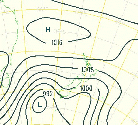
Flow Map - Migration

Flow maps show the movement of objects from 1 place to another. This image represents the top 10 states that migrate to California; downloaded from http://graphics.stanford.edu/papers/flow_map_layout/.
Cartogram -GDP of the World

A cartogram is a map where area or geometry of the earth is NOT preserved - it is distorted to represent the informaton being portrayed. This is a representation of the Gross Domestic Product of the world downloaded from http://www-personal.umich.edu/~mejn/cartograms/gdp1024x512.png.
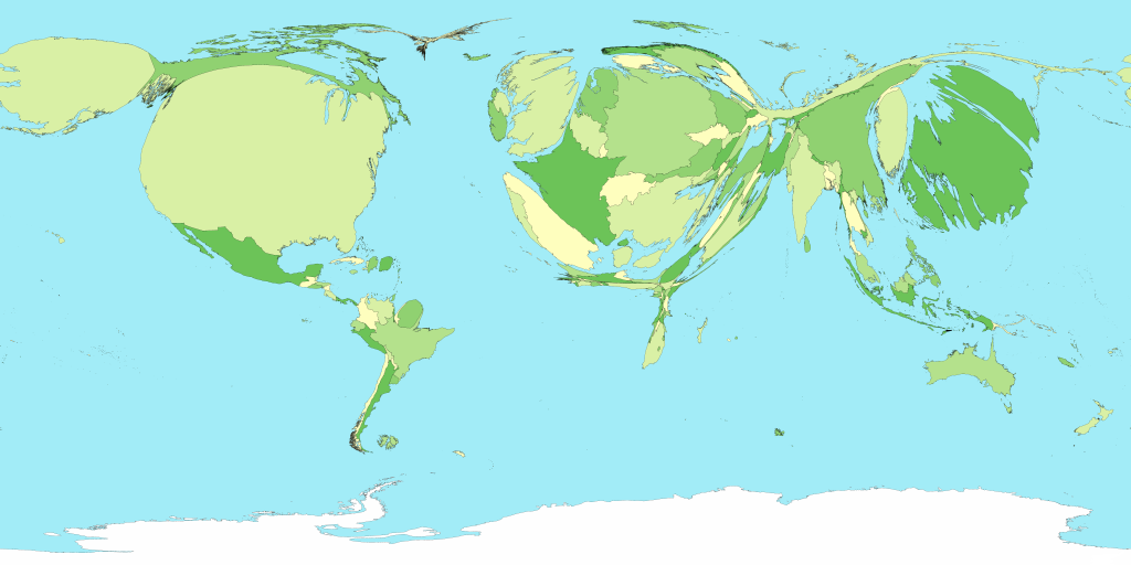
DRG - Blackwater Forest/Hurricane Lake

DRG of an area of the Blackwater State Forest which also shows Hurricane Lake. This particulare area is located along the border of Santa Rosa County and Okaloosa County. Image downloaded from USGS.gov. Image shows topographic features, hydrology, and section lines.
DOQQ - Navarre Beach, Florida

DOQQ of Navarre Beach, Florida downloaded from USGS.gov. Navarre Beach is located on Santa Rosa Island, a barrier island located off the coast of Northwest Florida.
Thursday, June 26, 2008
Remote Sensing-Google Earth Project

I visited the MODIS Active Fire Mapping Program (http://activefiremaps.fs.fed.us/wms.php). MODIS stands for Moderate Resolution Imaging Spectroradiometer. This is the sensor used on the satellite. MODIS is a multi-spectral sensor. The spatial resolution of MODIS is 250 m (band 1-2); 500m (band 3-7) and 1000m (bands 8-36)
( http://modis.gsfc.nasa.gov/about/media/modis_brochure.pdf). These measurements indicate longer wavelengths because they are in meters. MODIS detects over a wide range of the spectrum (multispectral). The referenced brochure details each band .. land/cloud properties bands 3-7; ocean band 8, sky band 17, etc.
This kml displays the United States with symbology representing the fire detections; I zoomed in to the Arizona area to see the geography of the area. The google image displays 1 km MODIS fire detections for the past 12 hours, 12-24 hours and previous 6 days; this was downloaded from Google Earth on Tuesday, June 24th. (NOTE: MODIS completes an image of the earth every 2 days). The Incident Management Team is located north of the Yuba River and all fire incidents occur south of the river.
Sunday, June 22, 2008
Choropleth Map/Proportional Circle Map

Choropleth maps can be used to show differences in area and on this map, the purple areas show the percentage of population who was eligible and who did indeed vote. The proportional circles correspond to the vote within these areas. Downloaded from http://www.ncgia.ucsb.edu/cctp/units/unit47/html/czech.html
Dot Distribution Map/US Census
 Known at the "Nightime Map" in the map series, it represents the 2000 population of the US. This is a very unique way of showing the density and coorelates to lights in the night; the brighest lights are the urban area's with the highest (density) of population. Downloaded from: http://www.census.gov/geo/www/mapGallery/images/2k_night.jpg
Propaganda Map

This map represents the "new world" as envisioned by an American of all people. The origins of the idea of a new world order are said to date back to Roman times. The concept is that the most powerful should establish a new world and bring the rest of the nations along with them - willing or not. Downloaded from http://strangemaps/files.wordpress.com/2008/06/1942world1600.jpg.
Hypsometric Map
 This is a hypsometric map of France which was downloaded from
http://www.reliefshading.com/colors/hypsometric.html. Color shading on this map represents relief within the country. Shading varies with the higher elevations being brighter. As such, along the western coast there is very little relief with the most significant elevation being found on the Eastern side of the country.
Thematic Map - Capitol

This map of the Capitol Area was downloaded from http://strangemaps.wordpress.com/. It is a flat, 2 dimensional map which shows the streets around the Capitol in Washington, D.C. with significant tourist destinations/landmarks identifed.
Subscribe to:
Posts (Atom)